Tuesday, June 14, 2011

Glass Attributes


In our previous post we filled you in on some of the latest trends, one of them being a strong use of glass. Check out all the options open to you through our friends at CK&D glass studios.


Here you can see more of the leaded styles that are available as standard options for your cabinets. You can have anything customized by one of their talented artists.


They can create glass designs for any project, large or small, in any area of your home; not only cabinetry.


Glass etching is also available for a completely unique design. Etching is mainly requested for shower enclosures and front entry doors.


View their online portfolio and perhaps you will find inspiration for a project in your home.


Saturday, June 4, 2011

2011 Design Trends

Here are the top 10 trends for 2011 as published by the National Kitchen and Bath Association. You’ll see classy, time-tested designs with some inspiring elements.

1. Commitment to Color:

The mango and carrot colors in this kitchen set off the modern design elements and allow the cabinetry and appliances to pop.
Homes where the kitchen opens into the family room and dining area need to balance the wall colors through out the the entire space.


2. Tactile Textures:

Notice the rug in this bathroom? Designers inset glass mosaic tiles into the limestone floor to create the look of a rug. I first saw this at a convention and I really did think I was about to walk on a carpet.


3. Glass Attributes:

This kitchen uses glass throughout to give the room a more cohesive look. Even the hood has glass elements.


4. Free Standing Tubs:

Though most bathrooms don't have the room for a free standing tub, you must admit it catches your eye. It can be seen from the bedroom through french doors that lead into the bathroom.


5. Espresso colored cabinetry:

Darker cabinetry is becoming more popular again. As long as you use enough lighting they won't make a room look dark.


6. Walk-In Pantries:

I really wish this pantry was part of my kitchen. If you don't have an actual room set aside for storage, your cabinets can become your pantry with many storage solutions created by Hafele. Base cabinets with deep drawers can hold dishes, serving platters, pot lids or small appliances.


7. Detailed Ceilings:

The rough hewn ceiling gives the appearance of age even though it was recently created. There are lots of trey ceiling styles that are often used in a master bedroom or a dining room to give the room a real "punch."


8. Natural Elements:


The beauty of nature abounds in a kitchen; especially in your choice of counter top material. Granite is the most popular counter top material with quartz products such as CaesarStone or SileStone a close second. If you decide to go with granite we make sure that you take the time to go to our fabricator and pick out the exact slab you want to use.


9. Tiered Proportions:

Using varying heights in your cabinetry or with a raised "breakfast bar" your kitchen develops more personality. A long, straight row of wall cabinets is boring. A raised "breakfast bar" doesn't just look nice, it can hide a sink full of dishes.


10. Inlaid Flooring:

For this bathroom a travertine tile was used with a wood-like tile. Tiles can be porcelain, ceramic, glass, metal real stone. Today shower walls often have an accent tile made of glass or metal. Bathroom floors can be laid down in a myriad of patterns and composition.


What elements could you incorporate into your home?

Saturday, April 23, 2011

Cabinet Door Styles

When you look at cabinets, what is the first thing you see? The doors and drawers. The great news is cabinet makers have an unlimited selection of stains, paints and glazes. Here are a few examples:

This door is cherry with a pecan stain and brown glaze, giving it a lot of depth in the details.


The doors below are more simple. The first is quarter sawn oak with a champagne stain. The second is Alder with a natural stain and brown glaze to bring out the linear design. It’s nice to see the different wood grains.


Here are two examples of painted cabinet doors. The top door has been painted and then given a distressed look using a brown glaze. It is antiqued over burgundy, and then treated with a brown glaze. The door on the bottom is painted a sage color. It doesn’t have a stain, and has a very even clean look to it.


One final benefit of the doors picture above is they are available from Geppetto Kitchens. They are a North Carolina business and a great way to buy high quality local products.


Here are some additional staining options, taken to a whole other level.
Royal Cabinets has paired with a North Carolina furniture maker to give even more intricate and detailed finishing options to cabinetry in their jewel collection. See these two beautiful examples below and visit their site to see all the options available. http://www.royalcabinet.com/jewel.htm
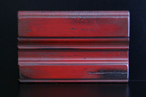
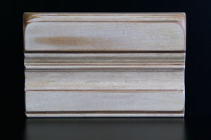

As you are looking to remodel your kitchen, bathroom, or do an addition please don't hesitate to visit our website and contact us. We have remodeled homes throughout Chapel Hill, Durham, Apex, Cary, and other triangle areas. Thanks for reading.


Tuesday, February 22, 2011

Kitchen Organization

It seems that whatever home design magazine you pick up, organization is key to their designs. Storage is always a big issue when redesigning a kitchen. Ever wondered what to do with all of your clutter? How can you use the space inside of you cabinets better? Well there are some great new cabinet and closet hardware pieces that will help you put it all away.


Maximize Kitchen Space! Make the most of your cabinets with Hafele or Rev-a-Shelf products. Some product ideas:


• Two Tier Cutlery drawer


• Use Drawers with Pegs:

• Creative Lazy Susan corner cabinets. They can hold your pans or your trash!


• Other Creative Drawers — Drawers have been upgraded with individual compartments that avoid a tangled mess and ones for knives protect both blades and fingers.


If you’re thinking about a kitchen redesign here are words of wisdom from Designer Kenneth Brown: "It's up to the homeowner. There is a point where the designer's role stops and the homeowner's role really starts. I can make a kitchen function and look really great, but I can't tell you where to put your cans of soup. Take your kitchen plans and label where everything is going to be. You have to do your homework to make sure the kitchen is going to function with how you cook."


If you're still looking for more space, think of where you could sacrifice space in the rest of your home in order to create a pantry.